Direct Mail , Graphic Design , Marketing Design a Killer Flyer For Your Next Direct Marketing Campaign
0 minute read
The practical guide to mastering flyers that get results for your business.
In this blog, we’re going to take a close look at the design side of flyers. Your flyer design has a huge impact on your ROI - so let's delve into the best practices to maximise your ROI every time.
Don’t forget the back!
We want to start by saying that when it comes to the design, there’s nothing, nothing, more important than making it double-sided.
Sure, it’s going to cost a little more to produce. But a blank back? That’s a complete waste of space. And it’s certainly not going to help you make more money.
Please, promise me you’ll use that space to your advantage!
Rant over. Now, let’s get down to it.
Designing your flyer is probably going to be a lot easier than you’re imagining right about now. There are so many tools out there that’ll be a huge help if this is new territory.
Really, all you need is patience and a half decent eye. But don’t underestimate the power of creating something really eye catching too.
Picture the scene. You’ve popped into the local cafe for your morning caffeine fix. You shuffle along the counter to grab some sugar but, just as you reach for the stirrer, something catches your eye.
It’s a flyer for a local gig.
You’re busy, you’re on your way to work (heck, you haven’t had that shot of caffeine yet) but still, something made you stop and take a second look.
It’s most likely it was a visual element that made you do it. You might not have been able to read any text from that distance, but the colours, the shapes, the illustration or maybe the typography still drew you in.
If you want your flyer to serve its purpose, it needs to be seen.
It’s a visual advertisement, whether it’s selling something or not.
So how can you make sure it stands out?
You need clear focal points, for starters.
There should be an element that draws viewers into the design. Whether that’s an image or graphic, a headline, a promotion or even a particular font, your focal point is going to be crucial.
And if you can create a focal point that directs viewers to the most important info you’re communicating? Even better.
Take a look at the example below. The flyer has two focal points: an eye-catching border and a succinct headline in attractive font.
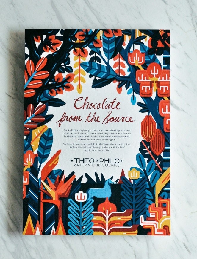 Theo Philo, Artisan Chocolates – Direct Mail Marketing Campaign
The border draws the eye to the centre of the layout, where the message behind the design is explained. The contrast between the darker colours of the border and the white background helps viewers to zero in on the copy too.
In this second example, the focal point is very obvious. The yellow stripe highlights the most important points on the flyer (the business name, web address and the key message).
Against the charcoal background, the yellow is super effective in showing viewers where they should be looking. See what we mean?
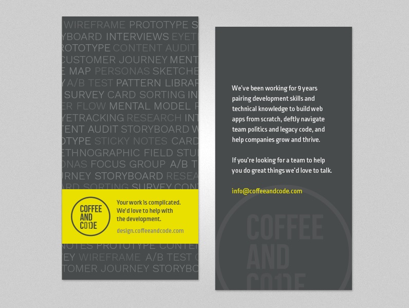 Coffee and Code – Direct Mail Marketing Campaign
Make sure your imagery is relevant.
The next important thing to think about is the imagery. It’s Got To Be Relevant.
It doesn’t matter if it’s a simple graphic, like shapes or icons, or a photograph in the background (or, if you’re really fancy, a custom illustration or hand-drawn typography). A visual component that’s relevant to the purpose or theme of your flyer will help viewers understand what this thing is all about.
This series of flyers for a university sports team uses photography really well.
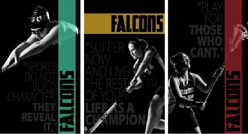 Falcon – Direct Mail Marketing Campaign
The combination of monochrome with such dramatic lighting really puts the student-athletes under the spotlight and draws the eye straight to them. Paired with the bright colour pops, the imagery becomes even more striking and equally relevant. What better way to promote university sports?
Check out this next one too.
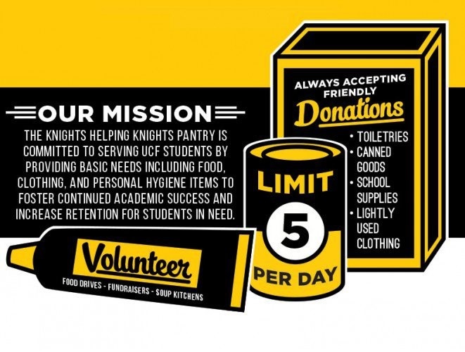 The Knights helping Knights – Direct Mail Marketing Campaign
It’s for donation and volunteering opportunities for a non-profit organisation. The flyer uses illustrations to incorporate crucial information with a pointer to the types of donation items needed. The black and yellow is pretty eye catching too.
Don’t underestimate the power of typography.
Another fail-safe way to make your flyer stand out is to use typography. And choosing the right font will take just as much care and consideration as picking the images.
Fonts have a real knack for giving a design a distinct look or mood, so you’ll want to think about the purpose, context and audience of your flyer and find a font that matches up with its style and intent.
This flyer uses a simple, friendly sans-serif typeface to advertise an app for parents of young children.
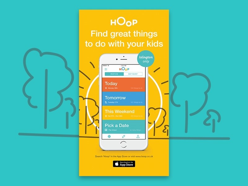 HOoP – Direct Mail Marketing Campaign
The simplicity hints at how easy it’ll be to use the app and appeals to its audience of parents who, let’s face it, probably don’t have all that much time to spend reading oodles of information.
This next one uses typography to pick up on the theme of the flyer’s content: a Halloween event.
Northwood Animal Hospital – Direct Mail Marketing Campaign
While the illustrations cleverly point to the type of business that’s hosting the event, the “spooky” typography alludes to the seasonal aspect and brings out the purpose of the design as a whole.
Don’t go too far with the whole theme thing, though. Readability is crucial so avoid any fonts that are a bit too ornate.
Colours communicate
Another thing to think about when you’re designing your flyer is the colours you use. Of course, colour can be used to grab attention and draw viewers to focal points, but they can do a whole lot more than that too.
Colour engages people’s feelings and emotions, so how will you use it to enhance your flyer’s message?
Warm colours like red and orange are thought to communicate warmth, energy and excitement.
Cooler colours like blue and green are supposedly more calming, nature-inspired and conservative.
As an example, this advert uses a calming ocean blue to complement its tips for keeping New Zealand’s coastlines clean.
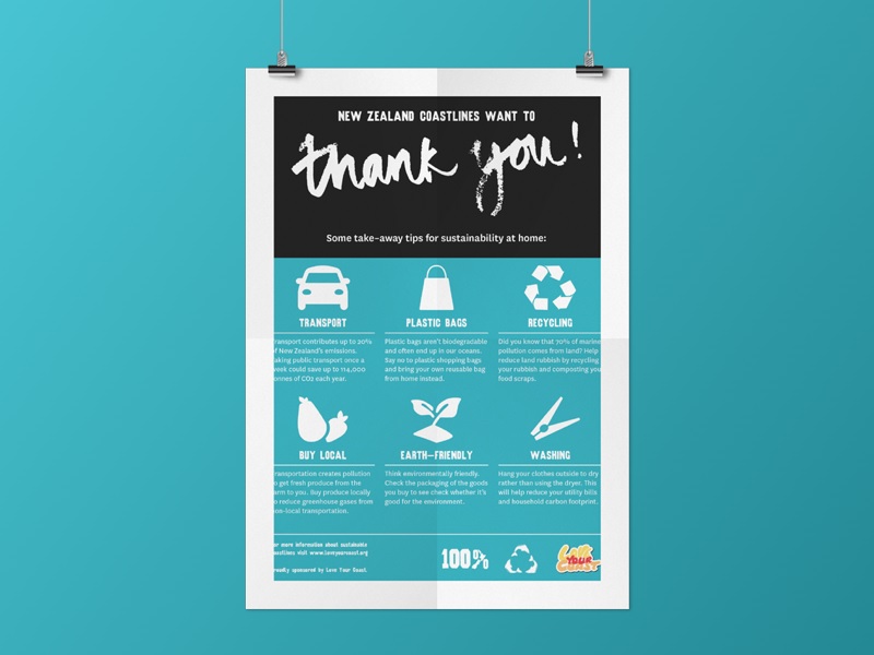 New Zealand Coastlines – Direct Mail Marketing Campaign
Colour choices don’t always have to be quite so literal though. In this example, a more abstract approach works too.
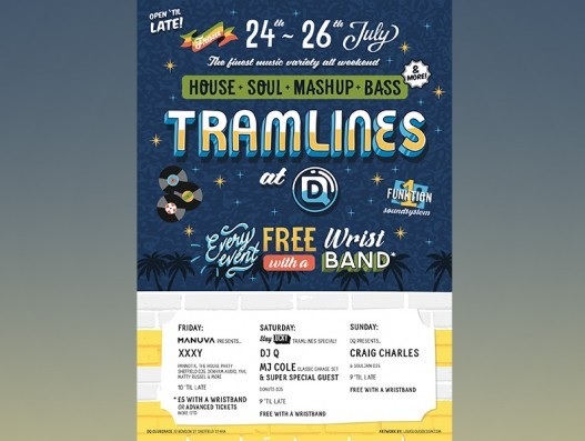 Event Marketing Campaign
The classic blue, white and yellow scheme lends a little seriousness to an otherwise whimsical design. The night-time background colour hints at the late-night festivities being advertised too.
Busy is bad
When it comes to the overall design, one thing to steer clear of is a crowded layout. Cram too much info onto your flyer and you’ll confuse your message and put people off bothering to work out what you’re advertising.
A balanced, well-spaced layout will make the pertinent information easier to find and the whole thing more attractive.
Creating a perfect balance is about more than limiting your copy though. It’s about accepting the importance of white space too. So ignore the temptation to use up areas without words or graphics to cram more in and let the white space be.
Use the margins and alignment tools in your chosen design program to help you make a content-heavy flyer look more balanced.
And don’t think of any blank bits as wasted space, think of them as pointers to the focal point of the flyer. A roadmap to help viewers navigate your layout, travelling from one design element to the next, if you will.
Take this concert flyer for example.
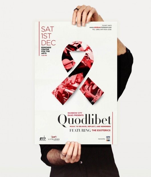 Quadlibet Concert – Direct Mail Marketing Campaign
You’ll notice white space and strategic text alignment that separate and organise the content. The result? A balanced layout that creates a dynamic, diagonal composition which leads the eye from one element to the next. It works and it looks good.
Final tips…
If you haven’t got much experience in the design department, find someone who does. But if you really do need to do it yourself, get as much feedback as possible on your designs.
Always come back to the fact that your flyer is there to attract as many people as possible, so listen to your feedback and go with a design that is clearly understood and liked by the most people.
And that’s pretty much a wrap.
If you’d like any more information about anything we’ve mentioned, or you’d like to discuss a flyer of your own, we’re always happy to chat. Click here to get in touch.

